When 20|20 Research wanted to create a stand-alone brand for their full-service consultancy division they asked us for help. The challenge was where and how to position them. First, we looked at the competition and then we dug deep into their offer to understand what made them different. We shared our thinking with them in a creative brainstorming session which the CEO described as “the best workshop session I have ever attended’”.
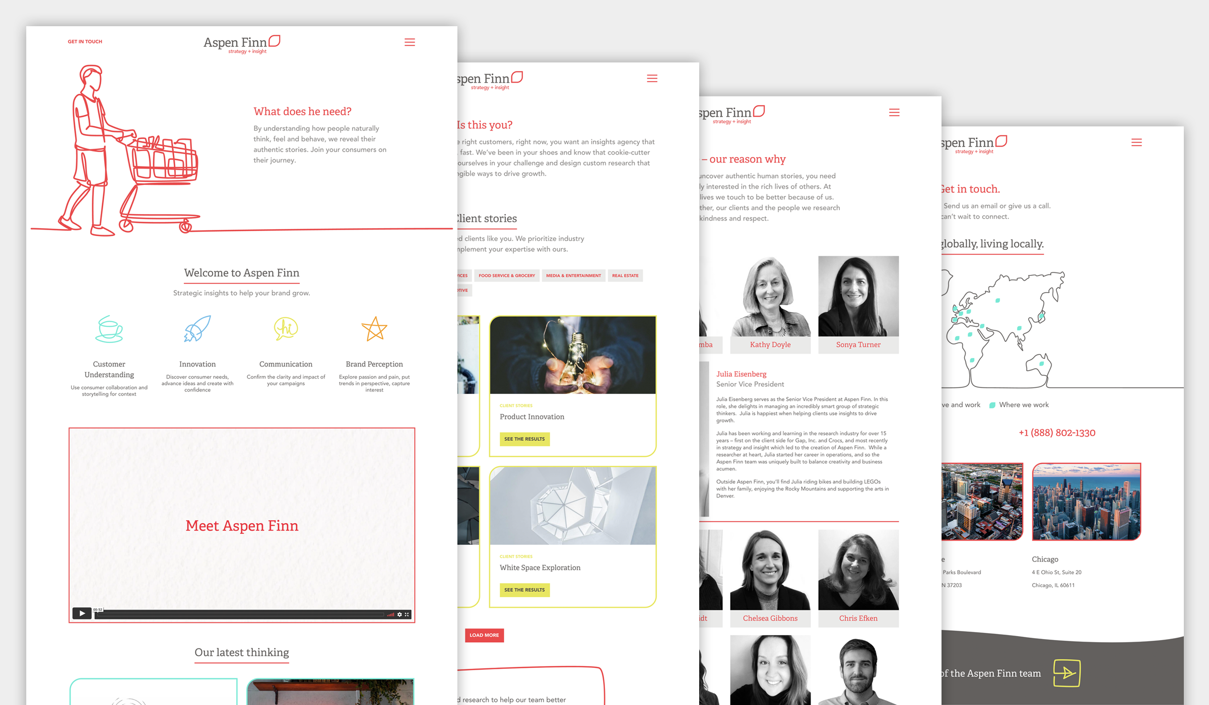
We took the learnings from our workshop and, using our creative briefing process, we devised their proposition, name and visual identity, based on their approach in understanding how people naturally think, feel and behave. The identity gave them a story for their brand. The symbol references natural elements such the leaf of an Aspen tree as well as the shape of a Finn (a kind of finch). Aspen trees exist in a grove and communicate with each other through a vast underground network.
This perfectly reflected the deep understanding the company developed from their natural approach to understanding people.
We built on the work we did for the proposition and identity and worked up the messaging, design and content for the new website. The concept of line drawings of people was selected as it reflected the simplicity of the identity and allowed the viewer to imagine the story behind each image. This idea was reinforced through the animated video we created for the home page.
“Bringing Aspen Finn to life with KAM was a delight. Their organised, creative and supportive approach was exactly what we needed at each stage of development. We were able to introduce Aspen Finn to the world on time and as planned which is both excellent and terrible as I will dearly miss regular contact with Lucy and Simon.”
Julia Eisenberg, SVP Aspen Finn