We conducted a thorough audit of all outputs used to understand how to improve deliverables and how to inject impact into the process. We identified over 31 frequently used chart types and created best-practice, easy-to-use, standardised versions and templates. We then coached each data analyst on design principles and the use of the new templates.
Transformative results
– A toolkit of designed charts; bar charts, pie charts, line charts, infographics and more.
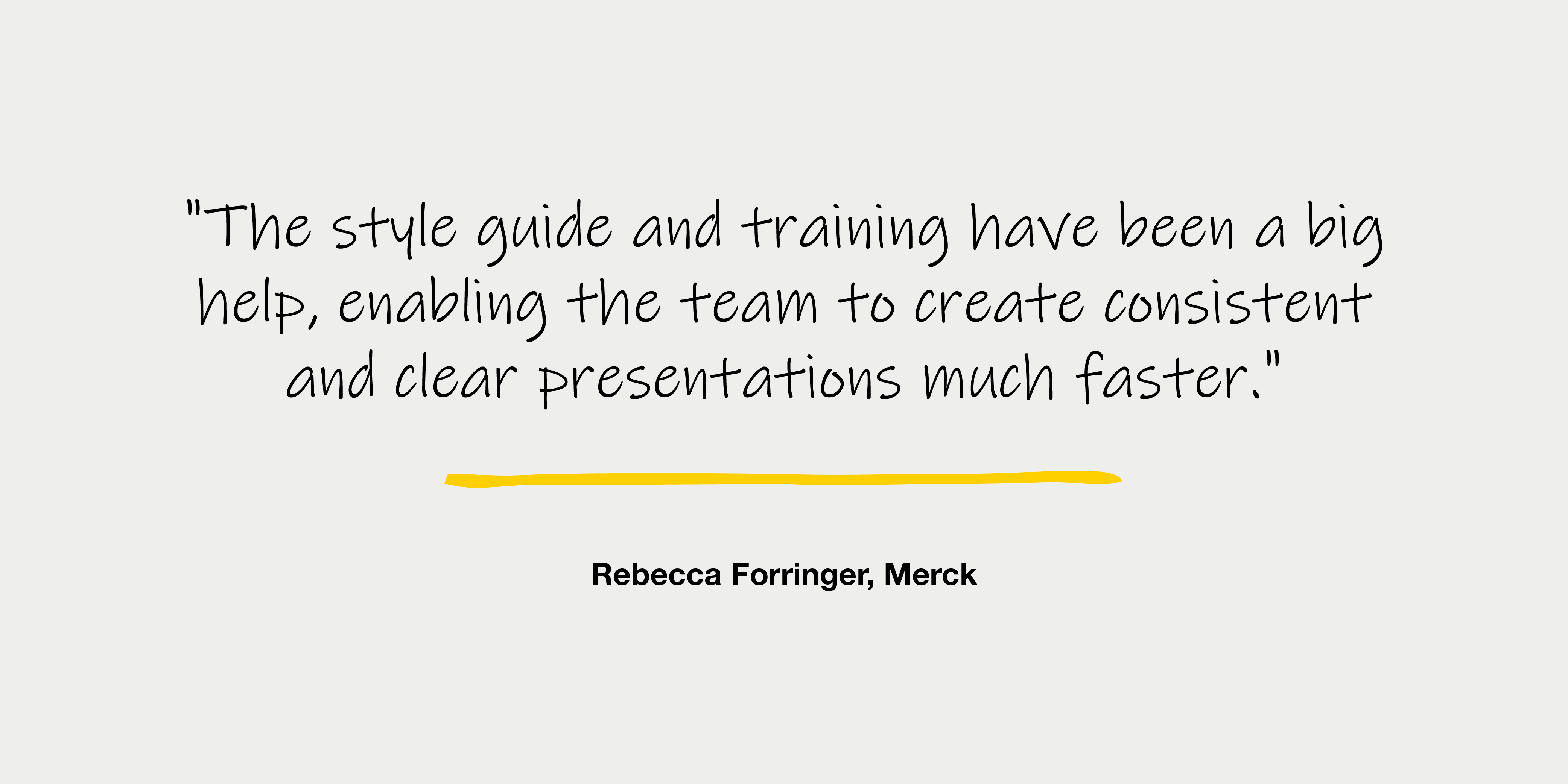
– Style guide embedded in the PowerPoint template to direct users.
– One-on-one training with all team members to ensure action.
Result: A significant boost in speed and quality of delivery.